
With the release of iOS 7, I’ve been hearing lots of muttering about how hard the home screens are to read with new system font (a variant of Helvetica Neue). While I do agree that the new font is slender and not particularly friendly to older eyes, I suspect much of the problem has to do with the wallpapers that people are putting on their home screens.
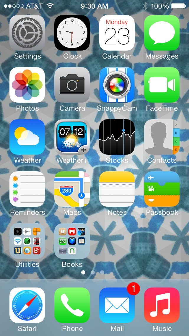
Here’s the thing: If you choose a bright, highly textured wallpaper image, like the image shown here, you’ll have a real problem.
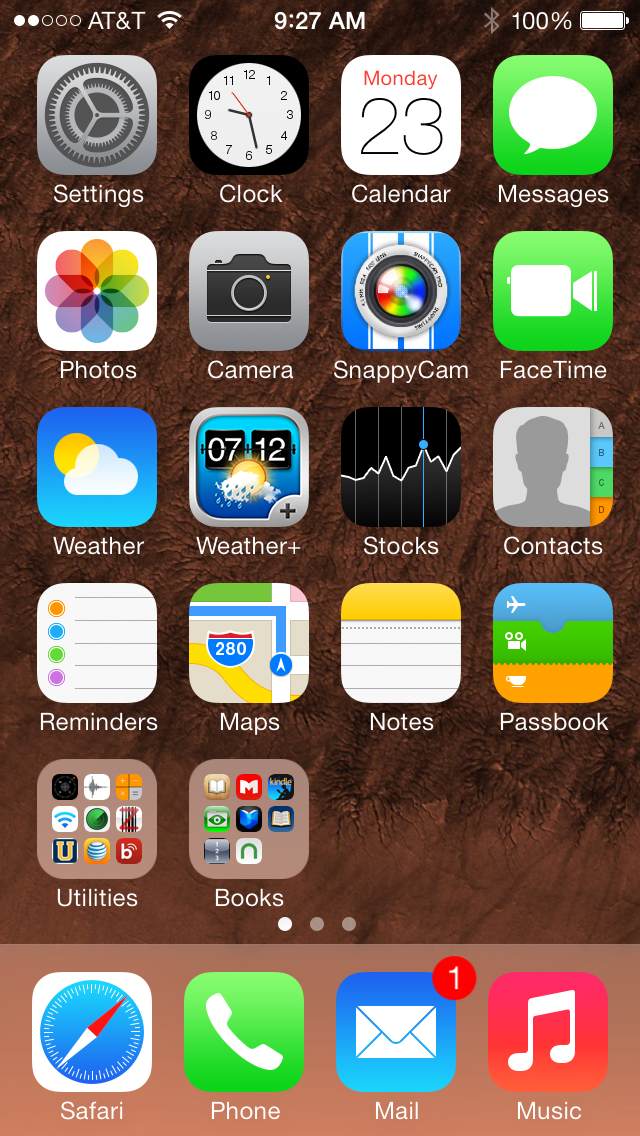
But, if you choose or create a wallpaper image that is relatively dark with few or no highlights, like this one here, the icon labels are much easier to read, and the color bleed-through in Notification Center and Control Center is much reduced.
I can cope with most of the changes, though I do not like them. I absolutely hate the neon icons screaming at me. They give me a headache. Apple needs to mute the colors.
For every person who wants Apple to mute the colors, I imagine there is another who would hate that change and say, “Everything looks too dull and muted now.” There is no pleasing everybody when it comes to taste.
But if you hate, hate, hate the “neon” colors, you really aren’t forced to look at them. Put all of the most offensive icons in a folder, and use Spotlight or Siri to launch your apps for you. Mischief managed.